
How do I make a cookie banner accessible and fair?
An accessible, fair cookie banner can be used with a keyboard and a screen reader, doesn't hide the content someone is focused on, and works on a small phone. Accept and Reject sit side by side with equal weight, optional categories start switched off, and a footer link lets people change their mind. This isn't legal advice.
The short version
- Every button and link in the banner works with the Tab and Enter keys, with a visible focus ring.
- Screen readers announce the banner and read real button names, not “button” or an icon.
- The banner doesn’t cover the thing someone is focused on, and it fits a small phone screen when zoomed.
- Accept and Reject are side by side with the same size and style. Optional categories start off.
- A “Cookie settings” link in the footer reopens the choices at any time.
This isn’t legal advice. An accessible banner can still break consent rules if it loads tags too early, so test both.
What does an accessible, fair banner look like?
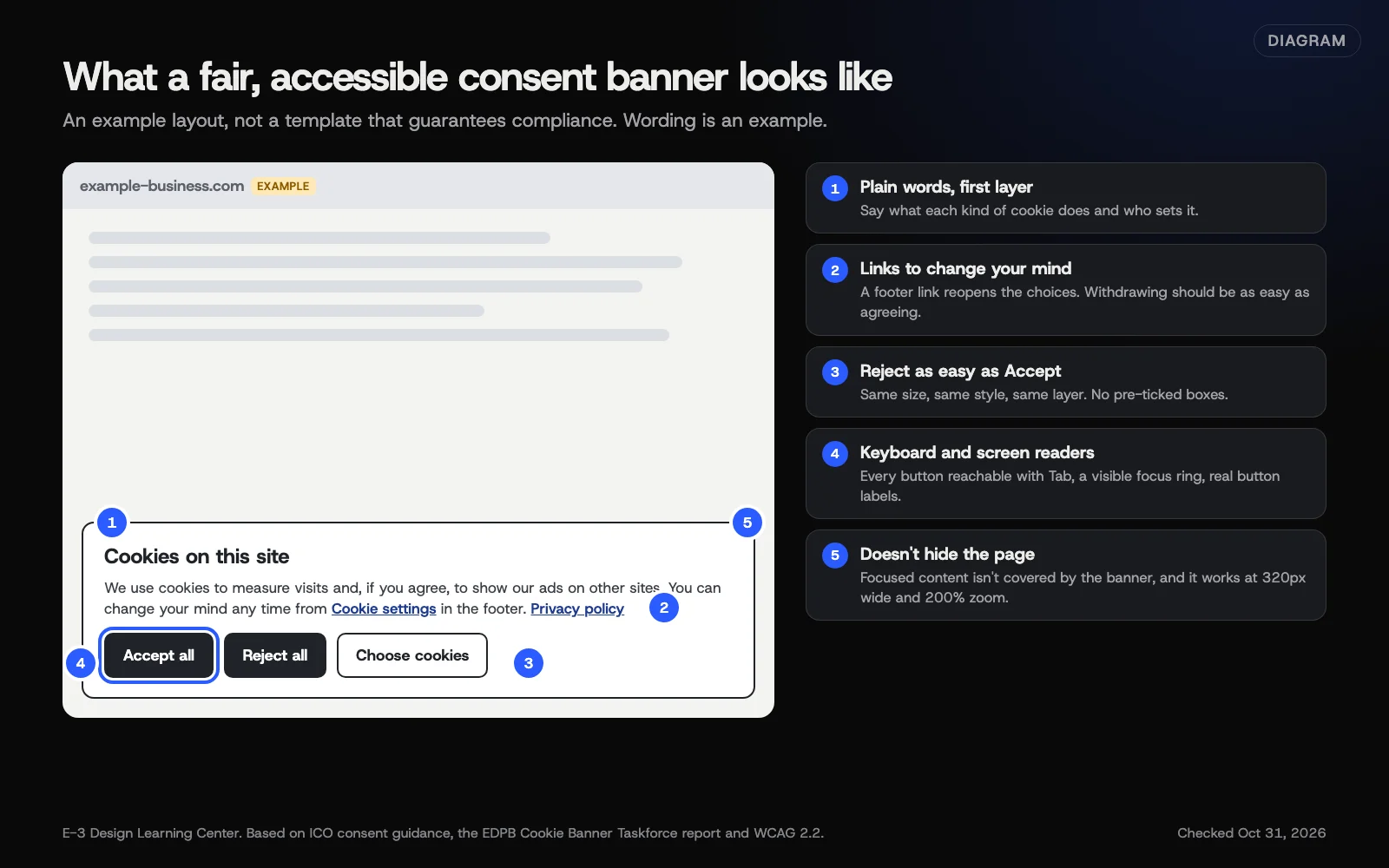 Diagram: an example consent banner with five labelled features: plain words, a way to change your mind, equal Reject and Accept buttons, keyboard focus, and not hiding the page. Wording is an example. Based on ICO, EDPB and WCAG 2.2 guidance (October 2026).
Fair choices
The ICO’s consent guidance says the mechanism should make it “as easy to refuse consent as it is to accept,” that optional items should be off by default, and that people must be able to withdraw “with the same ease that they gave it.” The EDPB’s Cookie Banner Taskforce recorded the same view among most EU regulators, including that a reject option shown only as a faint text link isn’t good enough.
Accessible to everyone
WCAG 2.2, the W3C’s accessibility standard, applies to the banner like any other part of the page. The criteria that trip banners up most:
| WCAG 2.2 criterion | What it means for a banner |
|---|---|
| 2.1.1 Keyboard (A) | Every control works without a mouse |
| 2.4.3 Focus Order (A) | Tab moves into the banner in a sensible order, not to the footer first |
| 2.4.7 Focus Visible (AA) | You can see which button is selected |
| 2.4.11 Focus Not Obscured, Minimum (AA, new in 2.2) | A sticky banner mustn’t completely hide the element that has keyboard focus |
| 1.4.3 Contrast, Minimum (AA) | Text, including the Reject option, has at least 4.5:1 contrast |
| 1.4.10 Reflow (AA) | It works at 320 CSS pixels wide without scrolling sideways |
| 2.5.8 Target Size, Minimum (AA, new in 2.2) | Buttons are at least 24 by 24 CSS pixels, or well spaced |
| 4.1.2 Name, Role, Value (A) | Buttons and toggles have real names and states screen readers can read |
The W3C’s What’s new in WCAG 2.2 page lists the two newer criteria above. Its example of focus being hidden is a sticky footer, which is exactly where most cookie banners sit.
How do I check my banner?
- Open your site in a private window so the banner shows.
- Put the mouse away. Press Tab. Does focus land in the banner? Can you reach Accept, Reject and settings, and press each with Enter or Space?
- Watch the focus ring. You should always see where you are.
- Tab past the banner if it stays open. Is the focused link on the page hidden behind it?
- Zoom to 200%, as the WCAG resize text rule expects, and narrow the window to phone size. Can you still read it and reach every button?
- Try a screen reader. VoiceOver on Mac or iPhone and NVDA on Windows are free. Listen for the banner’s heading and each button’s name.
- Check contrast with a free checker. Our free tools hub compares WAVE, Lighthouse and axe.
- Check the choices are fair: Reject on the first layer, same style as Accept, toggles off by default.
- Check it actually works: reject, then confirm no analytics or ad cookies were set. See do I need cookie consent?
Why does it matter?
The banner is often the first thing on the page. If someone using a keyboard or screen reader can’t get past it, they can’t use your site at all. The ICO also notes that consent pop-ups that are hard to read or use on phones may mean consent from those users isn’t valid.
What are the common mistakes?
- Focus trapped behind the banner, so keyboard users tab through the page without reaching it.
- An “X” icon with no label, read aloud as just “button.”
- Reject in light gray text while Accept is a big colored button.
- A banner that fills a phone screen with the buttons off the bottom.
- No way back. Once closed, the choices can’t be reopened.
- Toggles that look on but are actually off, or the other way round.
What if my consent tool can’t do this?
- Check its settings. Many tools let you change button styles, labels and layout.
- Look for the vendor’s accessibility statement or conformance report.
- If it can’t be fixed, switch tools. A banner that blocks people from your site costs you customers.
How much does it cost, and how long does it take?
The checks above take about 30 minutes and use free tools. Restyling the banner in your consent tool’s settings usually takes an hour or two.
How does E-3 handle this?
As part of website care, we can test your banner with a keyboard, a screen reader and phone sizes, adjust its settings and styles so Accept and Reject are equal, and add a footer link to reopen choices. You decide whether the change goes ahead. Our article on a practical start to website accessibility covers the rest of the site.
Related questions
Next step
- Privacy and cookies: the complete guideEvery guide in this topic, in order.
- Free website checkPublic checks on your own site, then an action plan of what to fix first.
Still stuck? Ask E-3 for an answer from our help guides.
Rather we handled privacy and cookies for you?
It’s part of what we do every week for small businesses, as part of website care. Start with a free check of your site and profile, or call and ask.