
How do I check and fix color contrast on my site?
WCAG Level AA asks for a contrast ratio of at least 4.5:1 for normal text and 3:1 for large text. Buttons, form borders, icons and focus outlines need 3:1 against what's next to them. Measure your real colors with a free contrast checker, darken the ones that fail, and never use color alone to carry meaning.
The short version
- Normal text: at least 4.5:1 against its background (Level AA).
- Large text: at least 3:1. The W3C defines large as 18 point, or 14 point bold.
- Buttons, form borders, icons and focus outlines: at least 3:1 against what’s beside them.
- Measure with a free contrast checker using your exact color codes.
- Don’t use color alone. Pair it with words, an icon or an underline.
How do I check contrast?
You need the two colors as codes, such as #767676, and a contrast checker. Most free checkers work the same way.
- Find the colors. Ask your designer for the brand palette, or use the browser’s developer tools: right-click the text, choose Inspect, and look for
colorandbackground-color. Many checkers also have an eyedropper. - Enter the text color and background color into the checker.
- Read the ratio. It runs from 1:1 (no contrast) to 21:1 (black on white).
- Compare it with the thresholds below.
- Repeat for every pair that matters: body text, links, buttons, text on photos, form borders, placeholder text and the focus outline.
The W3C’s Easy Checks cover contrast as one of their first-review steps. Automated scanners also flag low text contrast. See our guide to free accessibility checkers. Scanners can’t measure text on top of photos, though, so check those by hand.
Which ratios apply where?
| What | Level AA minimum | WCAG rule |
|---|---|---|
| Normal body text, links, labels | 4.5:1 | 1.4.3 Contrast (minimum) |
| Large text: 18 pt, or 14 pt bold | 3:1 | 1.4.3 Contrast (minimum) |
| Button edges, form field borders, checkboxes, toggles | 3:1 against nearby colors | 1.4.11 Non-text contrast |
| Focus outline | 3:1 | 1.4.11 Non-text contrast |
| Icons and chart parts needed to understand content | 3:1 | 1.4.11 Non-text contrast |
| Logos, disabled buttons, photos | No minimum | Exceptions in 1.4.3 and 1.4.11 |
These come from the W3C’s pages on text contrast and non-text contrast. The W3C treats the ratios as strict lines: 2.999:1 doesn’t pass 3:1.
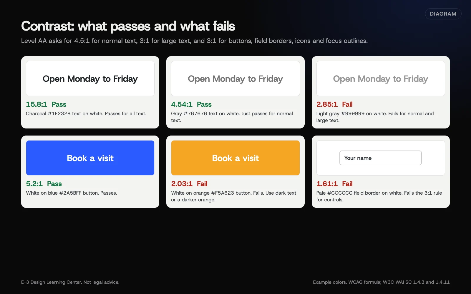 Diagram: example color pairs with their contrast ratios, calculated with the WCAG formula. Example colors only.
A few details from the W3C
- Button borders. A button needs a 3:1 edge only if nothing else shows it’s a button. A text label with good contrast can be enough.
- Logos. Exempt when brand guidelines set the colors. That exception doesn’t cover the rest of your design.
- Disabled controls. Exempt, because they can’t be used.
- Hover effects. A hover color change doesn’t need to meet 3:1. The normal state does.
How do I fix colors that fail?
- Darken the text, not the background, on light pages. Swapping a pale gray for a darker gray usually fixes a whole site in one style change.
- Keep the brand color, change its job. A pale brand color can stay as a background stripe or large heading and stop being used for small text or button labels.
- Fix buttons. If white text on your button color fails, darken the button or use dark text on it. Check both the normal and hover states.
- Add an overlay behind text on photos, such as a dark band behind white text, so contrast doesn’t depend on the photo.
- Make the focus outline visible. A thick outline in a color that meets 3:1 against both the element and the background works on most designs.
- Retest every pair you changed.
Ask your designer to add a “contrast-safe” version of each brand color to the palette, so new pages don’t bring the problem back.
Why not use color alone?
The W3C’s use of color rule (Level A) says color can’t be the only way to show information or ask for an action. Common failures:
- “Required fields are marked in red” with no asterisk or word.
- Links in body text that differ from normal text only by color. Underline them.
- A chart where the lines differ only by color. Add labels or patterns.
- Error states shown only as a red border. Add a text message.
DOJ’s web guidance lists both poor contrast and using color alone among the most common barriers on business sites.
Why does contrast matter?
Low contrast affects people with low vision and color vision differences. It also affects anyone reading a phone outdoors, on a cheap screen, or with tired eyes. Pale gray text is a design fashion that costs real readers. Fixing it is one of the cheapest accessibility wins there is.
What are the common mistakes and edge cases?
- Light gray placeholder text in form fields, used as the only label.
- White text on a bright brand color like orange, yellow or light green. These often fail.
- Checking only the desktop design. Phone layouts sometimes put text over images that the desktop keeps separate.
- Forgetting states: hover, focus, visited and error colors all need checking.
- Thin fonts. A ratio that passes can still be hard to read in a very light font weight. The ratio is the minimum, not the goal.
- Dark mode. If your site has one, check it too.
What if this didn’t work?
- The checker shows a pass but the text is still hard to read. Font weight and size matter. Make the text larger or heavier.
- You can’t find where the color is set. It may be in the theme, the page builder or a plugin. That’s a developer job.
- The brand owner won’t change the colors. Use the brand color for large elements and backgrounds, and a darker partner color for text. Our guide on building accessibility into a new website covers setting a palette that works.
How much does it cost, and how long does it take?
Checkers are free. Measuring your main colors takes about 15 minutes. Fixing a theme’s colors is often a short job for a developer, because colors are usually set in one place. Text baked into images takes longer, since each image must be redone.
How does E-3 handle this?
Color fixes are usually theme changes, so one fix can cover the whole site. On the sites we look after, they’re part of website care. Larger palette changes during a redesign are tested on a staging copy first.
Related questions
Next step
- Next: Video, audio and motion: what accessibility asksThe next guide in Website accessibility.
- Free website checkPublic checks on your own site, then an action plan of what to fix first.
Still stuck? Ask E-3 for an answer from our help guides.
Rather we handled website accessibility for you?
It’s part of what we do every week for small businesses, as part of website care. Start with a free check of your site and profile, or call and ask.